Tuesday 22 March 2016

Extended location shots


   LOCATION: Park Bench

   DESCRIPTION: A two shot of Lauren and Leon, presenting their happy moments together.

LOCATION: Rooftop

DESCRIPTION: A mid-shot and nearly an over the shoulder shot, conveys the sense that 
Koncheski arguably has the most power. Here is the first time Leon meets Koncheski to 
gain his trust.


LOCATION: Poker Night

DESCRIPTION: This is nearly and over the shoulder shot of looking behind the
subject at Leon. As well as a two shot, to present the bonding between Koncheski
and Leon.


LOCATION: Poker Night

DESCRIPTION: Below is a continued poker night scene, which is arguably a 
mid-shot, in order to convey some part of the subject in more detail while still
giving the impression of the whole subject. This shot makes room for more 
knowledge of mise-en-scene, in order to convey the scene of a poker night.


LOCATION: Rooftop (Koncheski Only)

DESCRIPTION: A Point-of-View shot of Koncheski looking away from the 
camera into the distance.


LOCATION: Koncheski walking away from the frame

DESCRIPTION: An establishing/long shot of Koncheski, presenting a clear
view of the setting. Allowing the audience to familiarize themselves with
the London location.


LOCATION: The vulnerable drug addict 

DESCRIPTION: A high angle shot, as the camera looks down at the subject,
almost intruding her privacy but also makes the subject look weak, submissive 
and frightened.


Location Shots


LOCATION: Deserted Street 

DESCRIPTION: One of Koncheski's men walks the deserted streets of London dealing drugs to vulnerable addicts


LOCATION: Deserted Street 2
DESCRIPTION: After trying to protect the drug addicts best interests, Lauren becomes victim to Koncheski's operation, and is left for dead


LOCATION: Kitchen
DESCRIPTION: Leon stands alone comtemplating all he has lost. Overcome with emotion he finds it hard to concentrate on his work, leading to problems with his case.


LOCATION: Police Chief's Office
DESCRIPTION: Leon's lack of work since the sudden loss of his girlfriend lands him in trouble with his boss. Despite worries regarding his work he assures his chief he'll crack the case and bring down Koncheski once and for all.


LOCATION: Leon's Office
DESCRIPTION: Leon's frustration build up and he becomes impatient trying to investigate Koncheski. He realises he has to look deeper to find out the truth behind the mysterious villain, but doesn't realise he could find out more than he bargained for.


LOCATION: Investigation Board
DESCRIPTION: Leon gradually collects more information about Koncheski and finds out that the death of his girlfiend could have been linked to the criminal he's been trying to take down all along. This only pushed him further to try and combat the kingpin's operation, in hope that he'll not only stop one of London's biggest drug operations, but also uncover the truth behind Lauren's sudden demise.


Monday 21 March 2016

Organizing through social media

Social media such as whatsapp really helped when organising filming for our trailer, it meant that we could communicate effectively and quickly with the members of our group and actors. It also meant that we could make decisions with each other easily regarding the different aspects of our film.


Media Film File


We decided that it was necessary to organise all our files and clips in a folder, in order to keep ourselves organised.

Tuesday 15 March 2016

Detailed structure of the trailer

A BRIEF OUTLINE (INCLUDING CINEMATOGRAPHY)

Scene 1) Leo and Lauren bonding. An establishing shot of them sitting together, 2 shot of them talking, close-ups of each character.
Scene 2) Lauren gets murdered, tracking shots of Lauren her walking down the street. Close-ups of her being strangled and falling to the floor.
Scene 3) Lauren’s funeral, pan shot of mourners, close up of Leon, establishing shot of cemetery.
Scene 4) Leon gets called into the police chief’s office, and they dispute over his case. Tracking shots or police chief and Leon, point of view shots from over their shoulders as they talk.
Scene 5) Leon going through a computer looking at files regarding the Koncheski case. Point of view shot, midshot.
Scene 6) Shots of Koncheski to establish his role. Tracking shots, long shots, and close-ups.
Scene 7) Leon meets Vladimir for the first time on the roof. 2 shot, mid shot.
Scene 8) Leon finds out that Koncheski is responsible for Lauren’s death.
Scene 9) Leon has to choose whether to betray Koncheski or join him.

Poster Inspiration


Friday 11 March 2016

Process of Magazine and Poster


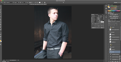
1. To begin the process of creating my film magazine, I placed the image
straight onto a new white document file, in order to begin the process of editing.


2. After deciding on what font to use for my masthead, I straight away placed
 and arranged it behind my main image, to convey the sense of my magazine
being popular amongst my audience that full name 'FOCUS' does not
need to be shown. It arguably presents that Seb Stewart playing Koncheski
is extremely powerful by being in front of the text. To present this I duplicated
the main image layer and placed the text behind it, I then selected the polygonal
Lasso Tool to cut around Seb's face, this allowed me to hide the text behind
the image.


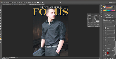
3. I decided to add a slogan, to capture the attention of audience by writing
'THE NEW AGE OF FILM', to attract them further I used the drop and
outer shadow to convey a 3D effect, in order to stand out against the
2D background.


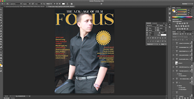
4. With a relevant choice of font, I was able to gather sell lines to place
at the left and right-hand side, to conform to the typical conventions of
magazine front covers. I created a button, using a font provider in order
to make the magazine more appealing to look at. This was reinforced with
an outer and drop shadow, to portray a 3D effect, to stand out to the
audience.


5. After the placement of sell lines and the button, I followed my initial
front cover ideas by having 'Seb Stewart as Koncheski' followed by 'Loyalty
Is The Enemy' as the headline and sub-headline. To complete this, I added the
title 'EXPIRED', I conformed to the typical conventions of film magazines, where
the font title of the poster and trailer, differs to the one placed on the magazine
front cover.


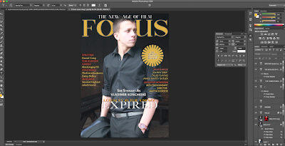
6. To continue the development of the magazine, I continued to follow
typical conventions by adding a bar-code to the bottom of the front cover,
hypothetically making it easier for my magazine to sell, if it was within stores.
To edit the front cover further, I used a plus sign, to present the additional
articles that would be within the magazine, therefore making it more value
for money.


7. To give the front cover, a cinematic feel, I placed a film roll,
to present the remembrance of the past greatest gangster movies,
that would be known by my target audience.


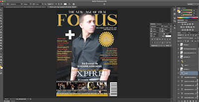
8. Finally, with a few tweaks and re-positioning of the placement of
words and objects, I was finally happy with the outcome of the front
cover as it defiantly conformed to the forms and conventions of film
magazines. Arguably to improve I would use free transform, in order to
re-scale the plus sign and make it smaller.


PROCESS OF POSTER PRODUCTION


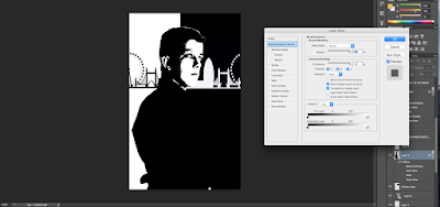
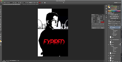
1. I began by placing black and white rectangles, to present a clear
example of binary opposites. I then placed the same white and black
effect above the main image of Seb, in order to make the poster
stand out to my target audience. To create a wind effect, I used
the blending tool to convey the sense that the still image is representing
Koncheski's running of his drug and violent operations.


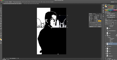
2. To present the London skyline, I used a mirroring effect, in order
to stress the effect of Koncheski's operations within London.


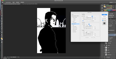
3. To portray a more visual wind effect, I heightened the control
of the inner shadow, making the main image stand out further.


4. I placed the masthead 'EXPIRED' in the middle of the poster,
ensuring that it was large enough to attract my target audience but
not too large to take up the entire poster.


5. After placing the masthead, I used a 'Riesling' font for the tagline
'LOYALTY IS THE ENEMY' ensuring that it didn't over complicate
the overall poster and that's why I have placed it above the skyline,
main image and title.


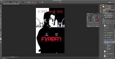
6. I then used the same 'Riesling' font for the actors name,
to familiarize the audience with the main actors of the production.


7. To continue to follow typical forms and conventions of film posters,
I used 'Steel Tongs' (font) to insert the names and roles of those
involved in the production, however, I minimized the font, similar to
'GOODFELLAS' and 'THE DEPARTED' because the audience would've
been aware of seeing credits on film posters.


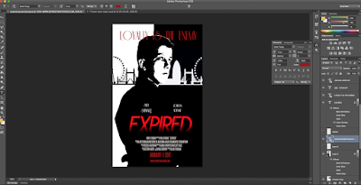
8. In addition to the credits, I added the release of the movie being
'JANUARY 1 2017' and the website of the production. This once again
familiarizes the audience with key information about the production,
especially the date.


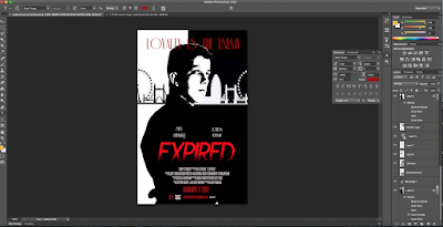
9. Finally, I completed the film poster by adding a 'SONY' and 'HD'
logo, as well as my production logo to make my poster look
professional to my target audience.


Poster Final and Magazine Final


Poster Draft